Overview
Overview is the first page under API-Management. The subtitle is Traffic, reliability, and latency across your API endpoints.
The Period control sits at the top right. The default is Last 24 hours. The other choices are Last hour, Last 12 hours, Last 48 hours, Last 72 hours, Last 7 days, Last 15 days, Last 30 days, and Last 6 months. Every figure and chart on the page follows that period. While the page loads, it says Loading API metrics. A refresh says Refreshing metrics.
Read it when something feels wrong
Set Period to Last hour while you are testing a change you just made. Last 24 hours hides a failure that started ten minutes ago inside a mostly healthy day.
| You see | What to open next |
|---|---|
| Success rate dropped, and the red band on Request volume grew | Top endpoints. Open the host with the amber or low success rate. On that endpoint, HTTP status codes names the errors |
| Avg latency jumped and the success rate held | The same endpoint's Latency chart, then the backend port and the health check. A slow backend still counts as success |
| Active endpoints is far below the total | Endpoints with no traffic in the period. They stay on the endpoint list, with an em dash under Traffic · 24h |
| A host you just created is missing from Top endpoints | It has no requests yet, or DNS is not sending traffic. Follow If the hostname does not open |
View all under Top endpoints opens the full list. The host in the table is a link to that endpoint.
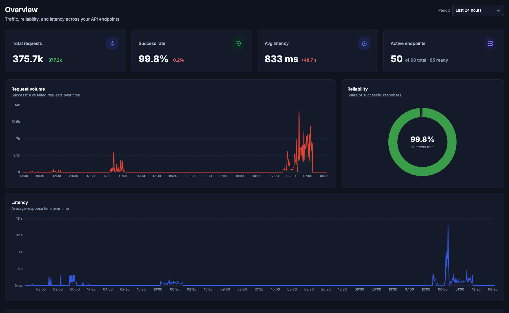
Overview in the default organization, Last 24 hours, on 5 October 2026. The signed number under a figure is the change Door reports for that period. Green is the direction you want: more requests, a higher success rate, or a lower latency. Red is the other direction.
The four figures
| Figure | What it shows |
|---|---|
| Total requests | How many requests the endpoints received in the period |
| Success rate | The share of those requests that succeeded |
| Avg latency | The average response time |
| Active endpoints | How many endpoints had traffic. The line under the number reads of {total} total · {ready} ready |
On that day the default organization showed 375.7k requests (+377.2k), a success rate of 99.8% (−0.2%), an average latency of 833 ms (+48.7 s), and 50 active endpoints of 68 total · 65 ready. Your organization will show its own numbers.
Charts
Request volume is subtitled Successful vs failed requests over time. Successful requests are drawn in green and errors in red, stacked in the same chart.
Reliability is subtitled Share of successful responses. The ring is the success rate for the period.
Latency is subtitled Average response time over time.
Top endpoints
Top endpoints is subtitled Ranked by request volume for the selected period. View all opens the full endpoint list. The columns are Endpoint, Status, Requests, Success rate, and Avg latency. The host is a link. The project name sits under it.
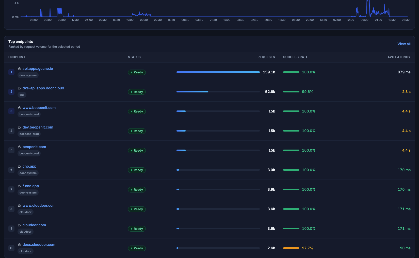
The ten busiest endpoints in the default organization for that same Last 24 hours. Status Ready is green. A success rate under 100% is drawn in amber, as on the last row that day.
An endpoint with no requests in the period does not appear here. The endpoint list still shows it, with an em dash in Traffic · 24h.